3D Rotating Molecules on the iPhone/iPad
Posted on by Adam GrossmanTurns out, canvas kinda sucks for developing full-screen animations on the iPhone and iPad. Without hardware acceleration and a more efficient clearing mechanism, it just doesn’t cut the mustard.
But all hope is not lost... CSS 3D transforms to the rescue!
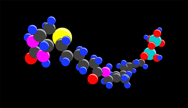
Check out this 3D molecule simulation we put together:
You can rotate the molecule around with your fingers, and pinch to zoom in and out. At blisteringly high frame rates. Try it out yourself.
(It currently works on iOS devices, Safari, and the latest dev version of Chrome... basically, any browser that supports true CSS 3D transformations / animations.)
So how does it work?
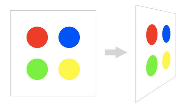
Take a gander at this simplified example, consisting of four rotating circles:
We apply the following CSS animation to the container holding the circles...
#container {
    [...]
    -webkit-transform-style: preserve-3d;
    -webkit-animation-name: spin;
    -webkit-animation-duration: 4s;
    -webkit-animation-iteration-count: infinite;
    -webkit-animation-timing-function: linear;
    }

@-webkit-keyframes spin {
    0%    { -webkit-transform: rotateY(0deg); }
    100%  { -webkit-transform: rotateY(360deg); }
    }
Which tells the container to spin around the y-axis perpetually. Notice, however, that the circles don’t look like three-dimensional spheres... instead, they appear as flat circles painting onto the plane of the container. In order to simulate the atoms of a molecule, we need honest-to-goodness 3D balls.
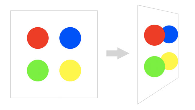
To accomplish this in CSS, we take advantage of a technique called "billboarding". Billboarding involves rotating an object (in our case, each of the colored balls), in such as way that it remains facing directly at the camera at all times. This is a fairly common technique in the world of 3D gaming, used to render things such as trees and grass — and in our case, it gives the illusion that the circles are really spheres.
Now, there isn’t any built-in method for billboarding an object using CSS 3D transforms, but its easy to fake: We simply need to rotate each circle individually in the opposite direction from the rotation of the parent container. We do this by defining an equal-but-opposite CSS animation, and apply it to the balls:
.ball {
    [...]
    -webkit-transform-style: preserve-3d;
    -webkit-animation-name: reverse-spin;
    -webkit-animation-duration: 4s;
    -webkit-animation-iteration-count: infinite;
    -webkit-animation-timing-function: linear;
    }

@-webkit-keyframes reverse-spin {
    0%    { -webkit-transform: rotateY(360deg); }
    100%  { -webkit-transform: rotateY(0deg); }
    }
Notice that the reverse-spin animation starts at 360 degrees and ends at 0 degrees, whereas the original spin animation was the opposite. Ta da! The results can be seen here:
Things become a little more complicated when it comes to arbitrary rotations about multiple axes in response to touch gestures (as seen in the molecule demo), but you get the idea! Pretty neat, huh?


